The abanico plot: visualising chronometric data with individual standard errors
Abstract
Numerical dating methods in Quaternary science are faced with the need to adequately visualise data consisting of estimates that have differing standard errors. Recent approaches either focus on the display of age frequency distributions that ignore the standard errors or on radial plots, that allow comparisons between estimates allowing for their differing precisions, but without giving an explicit picture of the age frequency distribution. Hence, visualising both aspects requires at least two plots. Here, an alternative is introduced: The abanico plot. It combines both aspects and therefore allows comprehensive presentation of chronometric data with individual standard errors. It extends the radial plot by a kernel density estimate plot, histogram or dot plot and contains elements that link both plot types. As part of the R package ’Luminescence’ (version ), the abanico plot is designed as the final part of a comprehensive analysis chain of luminescence data but is open to a wide range of other Quaternary dating communities, as illustrated by several examples.
keywords:
Luminescence dating; Fission track; Cosmogenic nuclides; Radial plot; KDE; R[cor1]corresponding author
1 Introduction
Many geo-scientific dating communities, such as luminescence (optically stimulated luminescence; OSL, thermoluminescence, TL), fission track (FT) and cosmogenic nuclides (CN), including radiocarbon (C) generate data that consist of age estimates with individual standard errors 11The term age is used throughout this article for simplicity and consistency although for example in luminescence dating typically equivalent dose () are used rather than ages.. There are several plot types for such chronometric data. Among them are rather simple representations of age estimates, without focus on errors (e.g., histograms or kernel density estimates). More insight into the data is possible when plotting standard errors explicitly in some relation to ages (e.g., plots of ages with error bars in ranked order or the radial plot). However, there is always a trade-off between adequate visualisation and straightforward interpretation of variability in ages and variability in errors. Galbraith and Roberts (2012) provide a thorough overview and discussion of currently available plot types for chronometric data with individual standard errors, focused on OSL data.
In this article, we argue for an enhancement of the radial plot
(Galbraith, 1988). A radial plot is a scatter plot, showing
data precision (reciprocal standard error) on the x-axis and a standardised
estimate of age on the y-axis. Thereby, data precision increases along the
x-axis and data variation around a given central value (e.g., the weighted mean)
manifests as dispersion along the y-axis. Hence, these two sources of
variability are geometrically separated. The radial plot further allows
projecting each measured value on a z-axis depicting a scale of ages, and
thereby in principle gives a sense of the corresponding ages and their
distribution. Nevertheless, this view on age distributions is not really
intuitive. Each age needs to be mapped by mentally drawing a line from the
origin of the scatter plot (zero at the x- and y-axis), through the data point,
to the z-axis. This drawback might be reduced by adding rugs, short lines
perpendicular to the z-axis at the projected position of each data point,
to the z-axis (e.g., as in Galbraith 1988). But still, the radial
plot is no intuitive tool to put emphasis on age frequency distribution. It
therefore seems useful to combine the advantages of the radial plot with those
of age frequency distribution plots, such as kernel density estimate plots,
histograms or dot plots. The abanico plot explicitly focuses on age frequency
distributions. Accordingly, it is not intended to replace the radial plot,
which provides an excellent approach to illustrating distribution of
standardised estimates and precision. A radial plot (also available as
function plot_RadialPlot() in the R package ’Luminescence’,
R Luminescence Developer Team 2015) can be a sufficient or even more appropriate solution, for
example when individual standard errors vary significantly or are high in
general.
Typically, the above mentioned plots can be produced by specific software, such as Radial Plotter (Vermeesch, 2009), Analyst (e.g., Duller, 2007, 2007, 2015), S-scripts, SigmaPlotTM and so on. In any case, it requires to prepare, import and modify the age data, create the plot and export/save it for potential further modification steps. Usually, this involves dealing with several programs, although it might be reasonable to work with just one software. Kreutzer et al. (2012) introduced a collection of functions for the statistical programming language R (R Development Core Team, 2015): the package ’Luminescence’ (current version 0.4.5). The primary goals of the package are to provide a free, open, transparent, modifiable and comprehensive tool for luminescence data analysis. Specifically, the package supports nearly all published age models and plot types to handle luminescence data. However, its applicability is not restricted to luminescence data. Other dating communities share a considerable portion of data analysis and might also benefit from the package.
The scope of this article is to introduce the abanico plot, a plot type that merges a radial plot with a kernel density estimate plot (or other univariate plot types if the user decides so). Thus, it combines the benefits of both plot types to provide a comprehensive view on chronometric data. The contribution shows options to modify the abanico plot for different display purposes. Several examples highlight the overall applicability of the abanico plot to different dating disciplines. A supplementary document provides a tutorial-like, step-by-step introduction to data import and how to create and customise the abanico plot.
2 The abanico plot
2.1 Philosophy and construction
The abanico plot is named after its fan-like appearance (el abanico [span.] – the fan, [aa’niko]). The initial concept of this plot emerged during the revision of an S-script by Rex Galbraith to create radial plots and is based on the combination of a radial plot and a kernel density estimate curve as suggested by Galbraith and Green 1990, Fig. 4, p. 204. Such aligned plots have been already adopted by fission track dating groups (e.g., Clift et al. 2013). However, a comprehensive view on both, standard error and data distribution characteristics requires further steps. Along with a list of the benefits of the radial plot, Galbraith and Roberts (2012) point at the necessity to look at more than one plot type in order to get a comprehensive view on the analysed data, i.e. to explore ages and associated standard errors in different ways. This is exactly the motivation to introduce the abanico plot to the scientific community. Although the abanico plot could have been built as a stand-alone programme (e.g., like the JavaTM-program Radial Plotter; Vermeesch 2009)22Ωhttp://www.ucl.ac.uk/~ucfbpve/radialplotter/ the authors decided to integrate it in the R package ’Luminescence’ (R Luminescence Developer Team, 2015). This strategy ensures continuous development and support as well as the possibility to handle the complete workflow of data analysis, plotting and further statistical evaluations in one software environment.
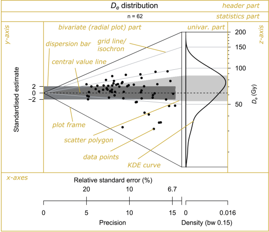
As stated above, the abanico plot consists of two parts (Fig. 1): a bivariate part (showing standardised estimates in relation to the precisions) and a univariate part (showing the age frequency distribution). The two parts are linked by a z-axis giving an age scale that is common to both. In a radial plot the z-axis is usually drawn as an arc of a circle, but here it is drawn as a straight line so that it can also be used for the univariate part. In general, a data set consists of measured values , , each with an associated standard error (i.e., a measure of deviation, not scatter). When no log transformation is used, denotes the estimated age for the t́h individual sample and is its standard error. When the log scale is used, is the natural log of the age estimate and is the standard error of the log of the age estimate. In the latter case is closely approximated by the relative standard error of the age estimate (i.e., the standard error of the age estimate divided by the age estimate). The precision (x-axis in the plot) is defined as the reciprocal value of the individual standard error:
| (1) |
Standardisation of the data (y-axis of the plot) means here subtracting a convenient central value from each value and subsequent division by the individual standard error , i.e.,
| (2) |
The default central value is the weighted mean with weights proportional to (cf. Appendix, Galbraith 1988). This results in a transformed data set, centred at and where each has unit standard error. This makes comparisons between the estimates easy, taking into account their differing precisions. For example, a set of estimates that agree with a common value will scatter with unit standard error about a line that corresponds to that value (about 95 % of them will be in a 2 range centred on that value). The default plot includes a 2 range (called a ’dispersion bar’) around the central value (the dark grey area in Fig. 1).
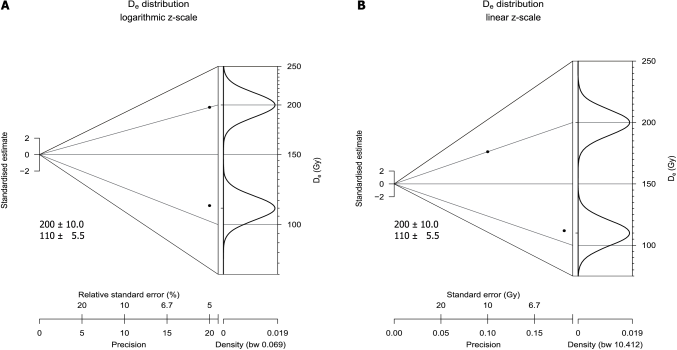
The data set can be plotted in linear or logarithmic form. This decision has consequences on the plot result. Fig. 2 illustrates the effects for two arbitrary data points with identical relative standard errors. If the abanico plot is drawn with a logarithmic z-scale represents the logarithms of the measured values, i.e. becomes , and is approximated by the relative standard error, i.e. (cf. Galbraith et al., 1999). Hence, the data are plotted without any difference along the x-axis. However, in linear form, precision is calculated as reciprocal of the absolute standard errors, which places the value with 10 Gy standard error towards lower precision.
The univariate part of the abanico plot can be one or more out of the following: (1) a kernel density estimate plot, (2) a histogram and (3) a dot plot. A kernel density estimate (KDE) is a curve that depicts the empirical estimate of the density function of the distribution that the measured ages were drawn from (Galbraith and Roberts 2012). The size of the kernel (i.e. the bandwidth) has important effects on the appearance (smoothness) of the resulting curve. There are several suggestions for optimal kernel sizes, most of them are implemented in R. However, in practice, relatively large kernel sizes are favoured and, hence, over-smoothed curves are produced (cf. Galbraith and Roberts 2012). By default, the abanico plot uses the method of Sheather and Jones (1991) to derive a suitable bandwidth (cf. Jones et al. 1996 for a methodological comparison). KDE plots are the default option for the univariate part of the abanico plot, mainly because they provide a reasonable picture of the underlying distribution of for a sufficiently large number of samples. Furthermore, KDE curves are efficient in visualising more than one data set at a time, i.e. it is possible to plot several curves over each other. For a literal explanation of the ideas, benefits and shortcomings of KDE plots see Galbraith and Roberts (2012).
Galbraith (2010) stresses some limitations of KDE plots. The abanico plot compensates those by linking univariate information to information from the bivariate part. In general, we consider a KDE as a more appropriate solution to illustrate age distributions than a histogram, given the bandwidth is sufficiently small and the number of measured values is sufficiently large. A KDE plot avoids graphically cutting the data set into bins of predefined class limit position. As it is combined with the bivariate plot part, it appears also unnecessary to explicitly display the sample size (cf. Galbraith and Roberts 2012), although this could be indicated by adding rugs to the z-axis.
Nevertheless, there are cases when KDE plots are not useful. For example if the data distribution is not continuous (although this can be handled with a small enough bandwidth) or if only very few measured values are available. In the former case a histogram might be more appropriate, in the latter case a dot plot may be chosen. A histogram displays the frequency distribution of measured values, grouped in intervals (i.e., bins). As with kernels in KDE plots, the bin width and locations of break points is crucial for histograms to adequately visualise the data distribution properties as unbiased as possible. In the abanico plot bin size and break point location can be set manually to override the default values. For an elaborated discussion of histograms with respect to chronometric data see Galbraith and Roberts (2012). Dot plots are very simple displays of data frequency distributions, similar to histograms. They show stacked dots, proportional to the number of values in bins and allow a fast and direct visualisation of individual values.
The two parts of the abanico plot are linked by their common z-axis, representing the age scale. This is made visually explicit by a set of ’isochrons’, i.e. lines of synchronous ages, that are horizontal in the univariate part and slope to the origin in the bivariate part (grey lines in Fig. 1). One or more bolder isochrons can be added to depict user-defined values (cf. Sec. 2.2). As a further visual aid, there is an option to shade in a ’scatter polygon’ (e.g., the light grey polygon in Fig. 1) highlighting the area between the lower and upper quartiles in the univariate plot and the corresponding isochrons on the radial plot (by default). This shows where the middle half of the s lies in both plots. As in Fig. 1, the scatter polygon may overlap with the dispersion bar. It is the dispersion bar, not the scatter polygon, that indicates agreement or otherwise of estimates with a specified value. In contrast, the scatter polygon characterises the age frequency distribution. Hence, by definition the two elements have different meanings and usually do not cover the same range.
In summary, the abanico plot amalgamates many of the advantages of a radial plot with those of a KDE. It allows assessing variation of data precision (along the x-axis), scatter around a user-defined central value, agreement of different values with each other, agreement between subsets of observations (all along the y-axis) and characteristics of the age distribution (along the z-axis).
2.2 Fine-tuning the plot
The abanico plot can be created by typing the function name in R,
followed by brackets, containing the variable name of data to be plotted:
plot_AbanicoPlot(data = age.data). A typical R-script might look
like the following:
| 1 | ## load the package |
| 2 | library(Luminescence) |
| 3 | |
| 4 | ## set working directory |
| 5 | setwd(”path/to/data/directory”) |
| 6 | |
| 7 | ## read chronometric data |
| 8 | data <- read.table(”data.txt”) |
| 9 | |
| 10 | ## create the plot |
| 11 | plot_AbanicoPlot(data = data) |
Or even more compact:
| 1 | ## create the plot |
| 2 | Luminescence::plot_AbanicoPlot(data = read.table(”path/to/data/data.txt”)) |
This produces a plot as shown in Fig. 1. However, the function
has a significant number of additional parameters (added and separated by
commas), which allow a flexible use of the plot for a range of purposes. The
plot may be adjusted by applying general arguments of the R-language.
It is possible to modify plot title (main), subtitle (mtext),
axes labels (xlab, ylab, zlab), colours for data points (col),
dispersion displays (polygon.col, bar.col) and grid lines
(grid.col), to add legends (legend, legend.pos), and to
adjust display ranges (xlim, ylim, zlim).
Apart from these rather general adjustments, more plot-specific and
sophisticated modifications are possible. The univariate part can show
one or more out of the following plot types: KDE (kde = TRUE, the
default option), histogram (hist = TRUE) and dot plot
(dots = TRUE). However, only a KDE is useful if more than
one data set is shown. Manual adjustment of the KDE bandwidth is possible with
the parameter bw, which can be set to a numeric value or to a keyword
indicating the method used for computation (e.g., bw = "nrd0").
Breakpoints (or bin limits) for the histogram and dot plot
can be specified, as well; either as the number of breakpoints to be computed
or
as vector of actual breakpoint values (e.g., breaks = 20). The
parameter plot.ratio controls the relative width ratio of the bivariate
and univariate part. It is set to 0.75 by default. The frame of
the abanico plot can be controlled by four options: frame = 0 (no frame
is drawn), frame = 1 (a frame is drawn that originates at zero precision
and zero standardised estimate and extends along the range of the z-axis, the
default option), frame = 2 (the frame includes the dispersion bar) and
frame = 3 (the frame appears as a rectangle and includes the entire plot
area). As shown in Galbraith and Green (1990), it is also possible to draw the
entire plot vertically (rotate = TRUE, cf. Fig. 5),
which puts more emphasis on the univariate plot part. The z-axis can be plotted
in linear (log.z = FALSE) or logarithmic (log.z = TRUE, default)
scale. Rugs can be added for better perception of the distribution of
individual values (rug = TRUE, cf. Fig. 5). Plotting of
the y-axis may be omitted (y.axis = FALSE) in cases where the scatter of
the standardised estimates is too small for appropriate visualisation. Error
bars may be added (error.bars = TRUE, cf. Fig. 3) for
small data sets or when it is necessary to show individual errors in relation to
each other. Since the R package ’Luminescence’ version 0.4.0 a
function is provided to calculate a wide range of descriptive statistics, both
in unweighted and weighted mode. The output of this function can be passed to
the abanico plot. Thus, it is possible to show any of the following statistic
measures, either as a subtitle (summary.pos = 'sub') or legend-like item
(e.g., summary.pos = 'topleft'): 'n' (number of samples),
'mean' (mean), 'mean.weighted' (weighted mean),
'median' (median), 'sdrel' (relative standard deviation),
'sdabs' (absolute standard deviation), 'serel' (relative standard
error), 'seabs' (absolute standard error) and 'in.2s' (percent of
data in 2 ). As noted by Galbraith (1994), there can be good
reasons to use another value than the default weighted mean to center the
z-axis. The function can calculate different values for standardising the data
(z.0 = ...), i.e. the weighted mean ('mean.weighted'), the
unweighted mean ('mean') or the median ('median'). It is also
possible to center the z-axis at a user-defined value (e.g., z.0 = 100).
To display more than one age population in a data set, it is possible to add
further dispersion bars (e.g., bar = c(100, 130), cf.
Fig. 6). It is possible to omit plotting both, the dispersion
bar (bar.col = FALSE) and the scatter polygon
(polygon.col = FALSE). Also, the default range for the scatter
polygon (dispersion) can be changed, e.g., to account for non-normal
distributions. It is possible to select 'sd' (one standard deviation),
'2sd' (two standard deviations), 'qr' (the quartile range, the
default) and 'pnn' (an arbitrary symmetric percentile range, whereby
'nn' must be an integer number depicting the lower percentile, e.g.,
5–95 %: dispersion = 'p5'). The abanico plot supports multiple data
sets (or subsets of one data set, cf. Fig. 5). The different
subsets must be passed to the function as a list of data frames (a native
data structure of the R package),
e.g., data <- list(data.1, data.2).
2.3 Integration in the R package ’Luminescence’
The R package ’Luminescence’ (R Luminescence Developer Team, 2015) is the essence of joint work of the authors since 2012 and is supported by a website (http://www.r-luminescence.de) with several tutorials (to which new users are kindly referred) as well as a discussion forum for the growing user community (evidenced by at least 9000 package downloads to date) and published documentation and guidance articles (Kreutzer et al., 2012; Dietze et al., 2013; Fuchs et al., 2015). Designed as a toolbox, the R package ’Luminescence’ intends to support routine work, e.g., Risø BIN-file data import and processing, as well as exploratory luminescence data analysis, e.g., spectra visualisation and investigation.
R (R Development Core Team, 2015) itself is a command line-oriented statistical programming language. Thus, it enables full access to each and every command and especially plot parameter, even after years - a characteristic that (almost) all mouse-input interfaces are lacking. This is where we see the main strength of R, along with minimum effort in reproducing and modifying calculations and outputs. It is recommended to use the package along with the programming environment RStudio (http://www.rstudio.org/) for a convenient workflow. Nevertheless, it is beyond the scope of this article to give a systematic introduction to R; for this see, e.g., Ligges 2008; Adler 2012; Albert and Rizzo 2012; Tippmann 2015. The supplementary material provides more detailed explanations and elaborated examples. It also contains the code that was used to create all figures of this article, although some were edited afterwards, for example to add information (Fig. 1).
3 Applications
Like the radial plot (Galbraith, 1988, 1994), the abanico plot is devoted to a broad scientific community to display data adequately and straightforward, but also to maintain the possibility to adjust the plot layout for specific purposes. In the following paragraphs we show selected examples of possible applications in chronometric disciplines without any intention to re-interpret the published data but rather to highlight which aspects might be revealed by data visualisation using the abanico plot. Furthermore, the data sets used to create the plots might not always be ideally suited, e.g. in terms of sample size, nature of errors, amount of auxiliary data. However, we tried to find a reasonable balance between these drawbacks and the goal to show the flexibility of the plot, possible fields of application, appropriateness and shortcomings of default plot settings and the need to adjust specific parameters.
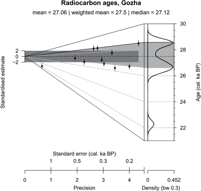
The first example (Fig. 3) is a radiocarbon data set from a study of the southeastern sector of the Scandinavian ice sheet by Rinterknecht et al. (2006). Since the data repository of the cited publication does not provide any information on base of the reported individual errors we treated them conservatively as one standard error. The abanico plot allows a straightforward overview of outliers, apparent age components and agreement of dates with respect to a central value (in this case the weighted mean) as well as containment of values in 2 (standardised estimates in dispersion bar) or containment in the quartile range (ages in scatter polygon). The lower outlier appears extreme in the univariate plot part but when taking its precision into account in the bivariate part, this impression becomes rather relative - mainly due to its comparably low precision. The presented data might either result from two distinct age populations or represent just one common age. In the latter case, their reported standard errors would be underestimated, which would have consequences for interpreting the youngest age as an outlier or not. The article by Rinterknecht et al. (2006) also presents a large data set of Be exposure ages of moraines for which the abanico plot would be well-suited.
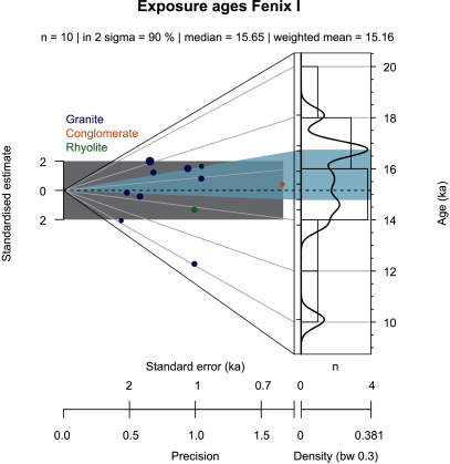
The second example (Fig. 4) shows cosmogenic Be ages of a late-glacial moraine (Fenix I) in Argentina investigated by Douglass et al. (2006). The abanico plot clearly reveals the influence of boulder height (circle diameter) and lithology (circle colour) on both, the deviation from the weighted mean age and the precision. Apparently, higher boulders yield lower precisions and the conglomerate sample shows a very high precision. Except for the lower outlier, all measurements fall into the dispersion bar and point at a consistent common value. The KDE curve mainly shows similar distribution trends like the histogram. However, in this case the KDE curve provides a more explicit visualisation of the outlier that does not correspond to the population comprising all other values. Also, the apparent modes of the suspected distributions are different for histogram versus KDE curve. Ideally, the histogram would have to be drawn with a larger than the default number of classes. Likewise, 10 samples are not sufficient to create meaningful KDE curves. Hence, the curve may just allow a rough perception of the distribution of ages rather than interpreting a meaningful pattern. The example demonstrates the different meanings of dispersion bar and scatter polygon. The dispersion bar cuts the isochrons, whereas the scatter polygon follows the isochrons. The two plot elements do not share the same range, as they obviously illustrate different data distribution properties.
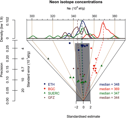
Fig. 5 visualises the results of an inter-laboratory comparison of Ne concentration measurements of one sample published by Vermeesch et al. (2012). The two CRPG samples are excluded and samples 6 to 8 from GFZ were also omitted because these were pretreated differently, which resulted in deviating measurement results. KDE curves are drawn for each laboratory data set separately. In an inter-laboratory comparison, the focus is not only on the similarities of measured values but also on individual precisions within and between laboratories. Both aims are readily visible in the abanico plot. The KDE curves give a straightforward impression of differences in variance and central tendency as well as locations of outliers, although it might be misleading to plot apparently erratic values as a density estimate curve. It is relevant to note that the individual standard errors are of interest in their own right. Additionally, they convey important information for comparing different measurements, within and among laboratories. Measurements from ETH and GFZ plot mainly inside the dispersion bar while others (especially the BGC data) fall obviously outside it, indicating no common value. As pointed out by Vermeesch et al. (2012) scatter among the laboratories is higher than could be explained by the laboratory-internal scatter. The abanico plot provides a clear view on exactly this. The ETH values cluster with comparably high precision and with generally low scatter around the central value (weighted mean in this default case). The BGC values show a systematic positive offset from the other measurements. This is visible in the bivariate plot part as a shift parallel to the central value line towards 3 and in the univariate plot part where this shift manifests as a discrete mode between 365 at/g and 385 at/g. The plot also shows the relationship between standardised estimate scatter and KDE curve shape (but not precision). In this version of the plot, the scatter polygons were not drawn because of significant overlapping.
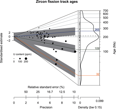
The last example refers to fission track data. Fig. 6 illustrates the ability of the abanico plot to include additional information of multivariate data. It plots the results of one zircon fission track sample (50 individual crystals, sample SH4), published by Kirstein et al. (2009), along with the published finite mixture model ages as denoted by the three labelled lines in the plot. Each individual measured value is displayed with a size corresponding to its uranium content. This reveals several trends in the data set; for example, precision increases with increasing uranium content, reflecting precision of detection. Additionally, younger samples show higher uranium contents. The three dispersion bars were centered at the means of the modelled component ages and allow connecting measured values with modelled component results. Although a sample size of 50 is sufficient to generate a KDE plot the resulting curve does not provide a good picture of the three components.
For further, non-chronometric applications of radial plots, and therewith the abanico plot, the reader is referred to Galbraith (1988).
4 Conclusion
The abanico plot overcomes most of the limitations assigned to existing plot types for showing chronometric data with individual standard errors. Thereby, it does not represent a fundamentally new invention, but rather the combination of established plot types, each with its own strengths and limitations. The abanico plot can be used to separate two sources of uncertainty: individual data precision and deviation from a common value. At the same time it allows for inspection of the data in their original age distribution. It is suitable for displaying multivariate data and can be used to show both, characteristics of individual values and the contribution of each value to a joined data distribution. Based on selected examples its flexibility and applicability has been demonstrated for different scientific fields focusing on Quaternary dating techniques. Due to its integration in the R package ’Luminescence’, the abanico plot can be utilised to visualise the results of age models, used in different scientific fields. Hence, we consider the abanico plot to be a valuable plot type designed for chronometric data, but potentially applicable for a wider range of scientific fields. We kindly ask scientists to share with us their experiences, emerging problems and limitations as well as discussions on how to improve plot functionalities in the future via the package forum (http://forum.r-luminescence.de).
5 Acknowledgments
First, we are grateful to the work of Rex Galbraith, especially for pointing at the idea to append further plots to the z-scale of a radial plot, for discussions about meaningful implementation of plot parameters and for providing the original S-script, which the radial plot function is based on. The initial version of the abanico plot and earlier versions of this manuscript benefited significantly from his elaborated and critical input. We also thank the R-Team for extensive commenting on an earlier version of the manuscript and the reviewer and editor team for their work on the final version of this contribution. Andrew Carter, Pieter Vermeesch and Samuel Niedermann are thanked for data discussion. The work of Sebastian Kreutzer was financed by a programme supported by the ANR - nANR-10-LABX-52. Cooperation and personal exchange between the authors is gratefully funded by the DFG (SCHM 3051/3-1) in the framework of the program ’Scientific Networks’, project title: ’RLum.Network: Ein Wissenschaftsnetzwerk zur Analyse von Lumineszenzdaten mit R’.
6 Appendix
-
measured values for ; .
-
standard error associated with .
-
precision defined as
-
individual standardised estimate defined as
-
central value of values, e.g., the weighted mean: with weights defined as .
-
x coordinate of a data point on the z-axis of the plot, with times the maximum value of .
-
y coordinate of a data point on the z-axis of the plot,
References
- R in a Nutshell. Oreilly & Associates Incorporated. Cited by: 2.3.
- R by Example. Springer. Cited by: 2.3.
- Zircon and apatite thermochronology of the Nankai Trough accretionary prism and trench, Japan: Sediment transport in an active and collisional margin setting. Tectonics 32, pp. 377–395. External Links: Document Cited by: 2.1.
- A practical guide to the R package Luminescence. Ancient TL 31 (1), pp. 11–18. Cited by: 2.3.
- Cosmogenic nuclide surface exposure dating of boulders on last-glacial and late-glacial moraines, Lago Buenos Aires, Argentina: Interpretive strategies and paleoclimate implications. Quaternary Geochronology 1, pp. 43–58. External Links: Document Cited by: 4, 3.
- Analyst. Cited by: 1.
- Assessing the error on equivalent dose estimates derived from single aliquot regenerative dose measurements. Ancient TL 25 (1), pp. 15–24. Cited by: 1.
- The Analyst software package for luminescence data: overview and recent improvements. Ancient TL 33, pp. 35–42. Cited by: 1.
- Data processing in luminescence dating analysis: an exemplary workflow using the R package ’Luminescence’. Quaternary International 362, pp. 9–13. External Links: Document Cited by: 2.3.
- Estimating the component ages in a finite mixture. Nuclear Tracks and Radiation Measurements 17 (3), pp. 197–206. Cited by: 2.1, 2.2.
- Optical dating of single and multiple grains of quartz from Jinmium Rock Shelter, Northern Australia: Part I, Experimental design and statistical models. Archaeometry 41 (2), pp. 339–364. Cited by: 2.1.
- Statistical aspects of equivalent dose and error calculation and display in OSL dating: An overview and some recommendations. Quaternary Geochronology 11, pp. 1–27. Cited by: 1, 2.1, 2.1, 2.1, 2.1.
- Graphical Display of Estimates Having Differing Standard Errors. Technometrics 30 (3), pp. 271–281. Cited by: 1, 2.1, 3, 3.
- Some Applications of Radial Plots. Journal of the American Statistical Association 89 (428), pp. 1232–1242. Cited by: 2.2, 3.
- On plotting OSL equivalent doses. Ancient TL 28 (1), pp. 1–9. Cited by: 2.1.
- A Brief Survey of Bandwidth Selection for Density Estimation. Journal of the American Statistical Association 91 (433), pp. 401–407. Cited by: 2.1.
- Pliocene onset of rapid exhumation in Taiwan during arc-continent collision: new insights from detrital thermochronometry. Basin Research 22 (3), pp. 1–16. Cited by: 6, 3.
- Introducing an R package for luminescence dating analysis. Ancient TL 30 (1), pp. 1–8. Cited by: 1, 2.3.
- Programmieren mit R (Statistik und ihre Anwendungen). 3., überarb. u. erweiterte Aufl. edition, Springer Berlin Heidelberg. Cited by: 2.3.
- R: A Language and Environment for Statistical Computing. Vienna, Austria. External Links: Link Cited by: 1, 2.3.
- Luminescence: Comprehensive Luminescence Dating Data Analysis. R package version 0.4.5. External Links: Link Cited by: 1, 2.1, 2.3.
- The Last Deglaciation of the Southeastern Sector of the Scandinavian Ice Sheet. Science 311, pp. 1449–1452. Cited by: 3, 3.
- A reliable data-based bandwidth selection method for kernel density estimation. Journal of the Royal Statistic Society 53, pp. 683–690. Cited by: 2.1.
- Programming tools: adventures with R. Nature 517, pp. 109–110. Cited by: 2.3.
- Interlaboratory comparison of cosmogenic Ne in quartz. Quaternary Geochronology in press, pp. 1–9. Cited by: 5, 3.
- RadialPlotter: a Java application for fission track, luminescence and other radial plots. Radiation Measurements 44 (4), pp. 409–410. Cited by: 1, 2.1.